CSS Project
CSS Project overview
The CSS Project was to demonstrate CARP (Contrast, Alignment, Repetition, Proximity). These are the major parts of making a good poster or just anything to get someones attention. Also the project was to teach us what dreamweaver can do.
Contrast
The contrast is what you see first. The brightest thing on a dark screen or vise versa. Otherwise you can make what you want the viewers to see bigger. An example is if you were selling a Delicious Cheeseburger you would make the background black and the words you want the audience to see big and white.
Alignment
The alignment is the placement of the text usually on the left or right for a more professional look. The title can be in the middle but the text should almost always be on the side. what this also does is allows for a easy-to-read paper
Repetition
Repetition is usually keeping a style and sticking to a writing style throughout the paper. Basically don't have one middle heading and one right side heading.
Proximity
This is how you should group things together. If you own a store and you put food and electronics together, your customer will probably leave. correctly grouping things is called proximity. This puts together a very organized writing or store.
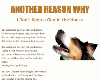
The Picture is an example of good CARP


Comments
Post a Comment